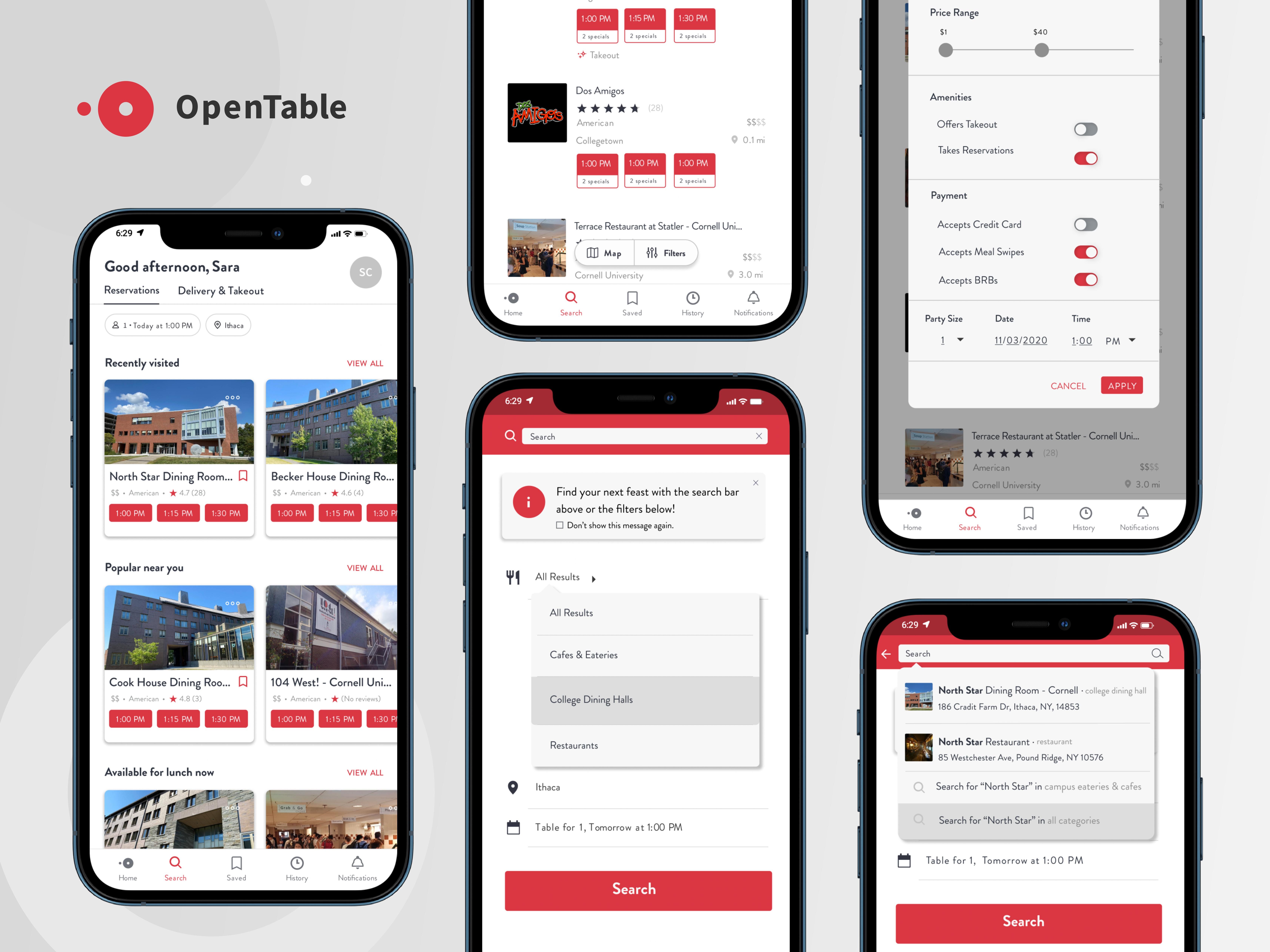

Cornell University has been lauded for bringing students back to campus and successfully containing virus cases this fall. Coming back to Ithaca this semester, however, I knew the university’s plans meant a lot of fundamental changes to daily activities like eating at dining halls.
Cornell recently partnered with OpenTable to regulate dining room capacities and safely distance students who want to get takeout, encouraging us to download the app and make reservations ahead of time. It’s worth noting that OpenTable is part of Booking Holdings, an engineering company that services international travel and booking search engines, so its main users aren’t college students.
This poses a few problems specific to the college experience because dining halls don’t function the same way as public restaurants. Colleges have their own student meal plans and payment and check-in systems in place, which may not align with the policies of public restaurants.
In this case study, I explored filtering for more relevant information on OpenTable through a search by categories feature.
Problem Space
Initial Thoughts
Based on my experience with the app, I expected other students to have run into the same issues I did, such as finding the hidden search bar, realizing the “missed reservation” notification system isn’t synced with Cornell’s official GET check-in system, and figuring out the notifications about rewards don’t apply to college dining halls.
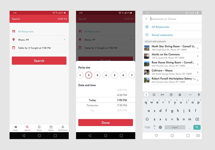
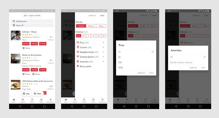
Before conducting user research, I started with a tentative people problem:
OpenTable allows college students to make reservations at dining halls ahead of time. However, it is hardly used because:
1. Using the app requires a lot of guesswork.
2. Users consult multiple apps to get the information the OpenTable app doesn’t provide.
User Research
Users
On OpenTable, there are two main types of college-age diners:
- Occasional: Students who live off-campus and are not on a meal plan. They occasionally visit dining halls and rarely use the OpenTable app.
- Frequent: Students who live on campus and are on a meal plan. They visit dining halls frequently for their meals and use the OpenTable app each time to make a reservation.
My goal was to identify key pain points in the reservation process that might be discouraging students from using the app by answering these questions:
- What barriers do users face when making a reservation on OpenTable?
- How do users get the information they need to make a reservation?
- How does the pandemic influence users’ dining decisions?
Interestingly, trends in my results showed that before users can even make a reservation, they have a lot of trouble finding the place they want to eat at in the app.
Key insights
- Most users navigated to the search feature tab first to look for a search bar.
- Users couldn’t see dining halls until they specifically searched for them.
- Users prefer takeout over dining in to save time.
- Users were unsure if they successfully made a reservation.
New People Problem
OpenTable allows college students to make reservations at dining halls ahead of time. However, it is hardly used because:
- They have a hard time finding relevant search results.
- The app doesn’t communicate enough information about reservations to users.
Figuring Out What Feature Space to Improve
Brainstorming
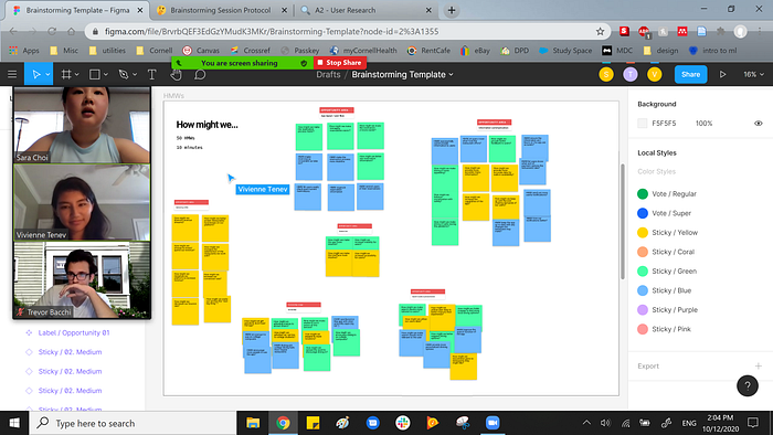
I recruited my friends Vivienne and Trevor as brainstorming buddies. After exploring and narrowing down the solution space, I decided to pursue one of three possible features:
- Add separate rows for college eateries and dining halls in search results
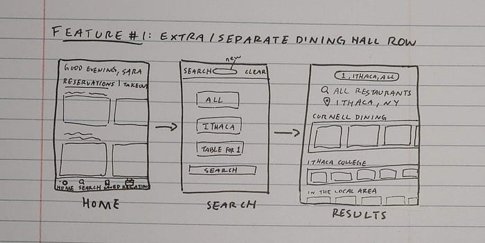
2. Sort by eatery type
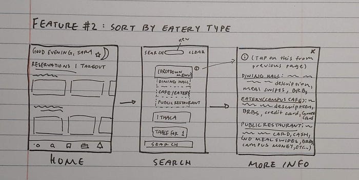
3. Sort by different payment options
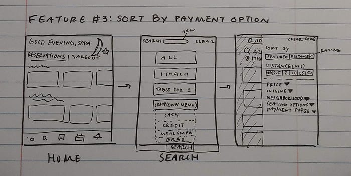
However, after discussing this with my peers, I decided it would be best to combine the last two ideas into a single, overarching feature related to searching by categories within the OpenTable app.
Content
Users were frustrated because they couldn’t find relevant results very quickly with the current search feature. After sketching a few of my ideas, I identified some key feature requirements for the feature:
- Advanced search
- Federated search
- Search result filters
Finding an Entry Point

Option A: Move the hidden search bar from the “All restaurants” filter on the main search page to the top of the screen. Keep the current homepage the same.
Option B: A homepage doubling as a search page. Users would be able to manually type in search terms right away.
I went with Option A because a user flow starting from there seemed more intuitive even though the entry point is more visible or obvious in Option B. From my user research earlier, the first thing participants did was look for the search tab and scanned to the bottom of the screen to find it. User testing later revealed some users didn’t like the idea of a page serving more than one function because it confused them about where in the app they just jumped to, so I decided to pursue Option A.
Information Hierarchy

Medium-Fidelity Explorations
After identifying an entry point and typical user flow, I started fleshing out wireframes in Figma with medium-fidelity explorations.
1. Advanced search

- Multiple search fields accommodate users’ varied preferences for specificity. Entering information into all or any fields would be optional to ensure the app is usable for those who know exactly what kind of eatery they want as well as users who are not as sure.
- Allowing users to search by ranges with sliders for quantitative fields like price is necessary so that they aren’t limited in their options and can view more relevant results.
- Allowing users to manually input the date and time of day instead of choosing from the current scrolling menu gives them more control.
2. Federated Search
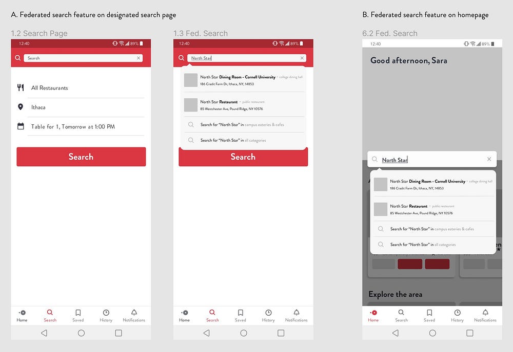
- Eatery profile images allow restaurants to create familiarity with users and be easily recognized in search bar suggestions.
- Category labels for the different databases within OpenTable reduce user confusion and help them find what they need more quickly.
- Icons reduce user confusion by helping to distinguish search queries within different databases from restaurant suggestions.
- Restaurant suggestions would have their profile image instead of an icon next to their name to indicate they lead to the restaurant’s profile page instead of a search results page.
3. Search Filters

- Option A uses Entry Point B from the search bar on the homepage and takes the user through multiple screens within the Categories pages. Each screen has more white space and seems less cluttered than those in Option B, but because there are more screens, there are more opportunities for the user to feel lost within the app.
- Option B uses Entry Point A from the designated search page and displays the filter feature as a pop-up window on the search results page. Toggles are used because they’re consistent with OpenTable’s UI and recognized by most users as indications of off/on switches. Slider indicators, as opposed to dropdown menus, also give users greater flexibility with their options and a better sense of what quantitative values like pricing mean. “$1 - $40” is much more specific than “$$” to users.
- Option C also uses Entry Point A and integrates Option A into the current filters on the app’s designated search page and displays Option B on the search results page. The dropdown menu reduces the number of screens for the filter feature and shows users the information hierarchy of categories and subcategories.
Visual Design
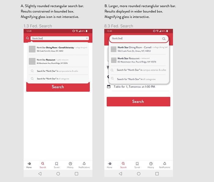
User testing showed that most users preferred the visual aesthetic of Option B but would rather see Option A implemented because it follows the app’s current UI.

I went with Option B because two of my users during user testing were confused by the presence of two search tools on one page. Adding a dismissible a pop-up message the first time a user opens the app is a flexible way to let users adjust the amount of guidance they want.
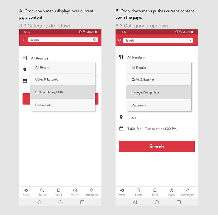
I went with Option B because during user testing, I showed participants Option A and a majority of them told me there was too much empty space on the screen. Pushing the content down the page was an efficient way to use that space and avoid covering up important page content.
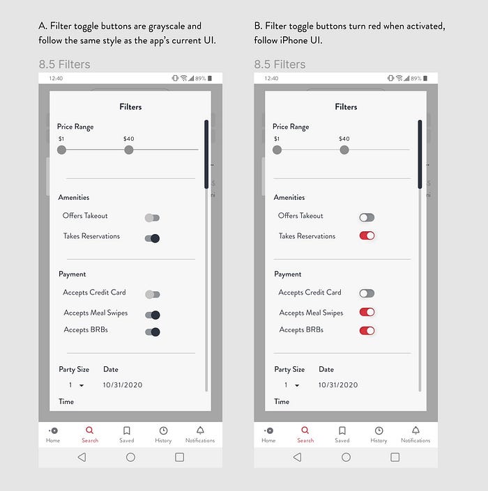
Although Option A follows OpenTable’s current UI, I went with Option B because feedback from user testing showed that users associated color with not only interactivity, but also on/off conditions. Option B follows the iPhone toggle button style but still communicates the same concept to Android users.
Design System

Final Interaction
Takeaways
OpenTable has made it easy for Cornell students to safely eat at dining halls. However, for a platform originally intended to serve the general public and not the college demographic, OpenTable’s current search feature fails to effectively serve students and for this reason has lower usership. OpenTable doesn’t need to be tailored specifically for a certain target group, but it should be customizable to some degree to allow different users to tailor their own experience.
This was my first full-length case study, and I hope you enjoyed walking through my creative journey with me! Throughout the three months of this project, I had the chance to apply my background in graphic design to my studies in behavioral science and psychology and loved every minute of it. Analyzing my results from user research interviews was one of the most eye-opening parts of the process for me, and it was so rewarding to see those abstract textbook concepts appear in real life in real people. I love thinking to design for people and can’t wait to start my next design project!
Sara Choi is a student studying Communication and Behavioral Science at Cornell University. This is her first UX case study.